You know how every time Facebook makes the slightest change to its page layout, everyone FREAKS OUT and tries to figure out what it all MEANS and what the world is coming to and whether the END IS NIGH?
Well, right now Google is experimenting with a pretty drastic change to the way nonprofit email messages appear in Gmail. And while we don’t think you should hit the panic button, this has the potential to be what Joe Biden would undoubtedly call a Big F-ing Deal.
For a few months, Google has been quietly testing a new feature on Gmail that allows for a more visual version of the Promotions tab. It’s called Grid View, and it presents some challenges for the unwary — and big opportunities for the clever and creative (that’s you, we know it is). Now’s the time to get ready to take advantage.
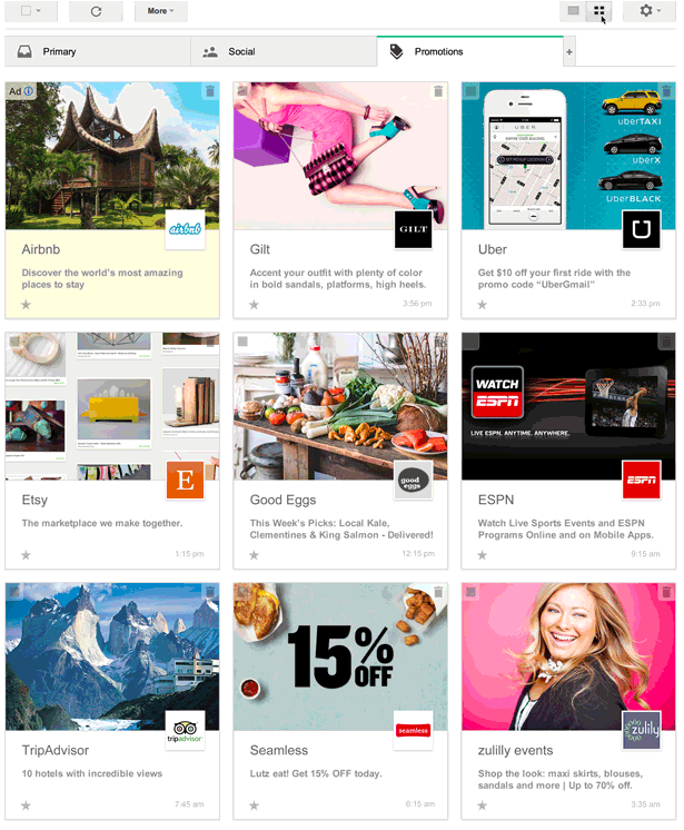
With Grid View, Gmail turns a sea of words into an easily discernible, image-focused tile system. Call it inbox Pinterestization if you like. (Or don’t, that’s actually kind of hard to say.) Coupled with strong subject lines, the new, bolder images in this layout give your organization a chance to stand out in a big way.
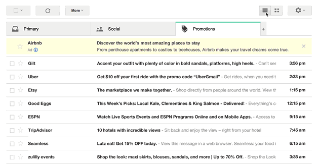
So what’s it look like? Basically, you go from an inbox that looks like this:
To this:
Pretty sweet, right? But before you run off and start recoding all your messages to feature pictures of kittens, there are a few details to sort through.
For the time being, this feature is still being tested and is currently invite only, so keep in mind that not all of your Gmail subscribers will see your jazzed up emails…yet. Want to be part of the testing group? Click here to request an invite. Now is the time to get a head start on learning how to prettify your emails.
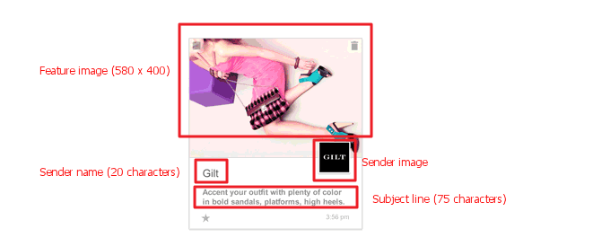
There are four basic component to each individual tile in the grid, and the good news is you’re already using two of them!
1. Subject Line: This is the same subject line that appears on your emails currently. Google will set a 75 character limit on Grid View subject lines, and will not show pre-header text. This means that your entire call to action needs to fit in this 75 character limitation. Any subject line longer than 75 characters will simply be truncated.
2. Sender Name: This is what appears normally under “sender.” There is a 20 character limit on sender names. Like subject lines, any sender name over 20 characters will be truncated.
3. Sender Image: This is the slightly smaller image that functions as your “profile picture” of sorts. If you have a Google+ profile, Google will pull your profile image and use it as the sender image. This is optional, and if not set, Google will grab a block letter (typically the first letter in your sender name) and add it to the Sender Image area.
4. Featured Image: This is the big, splashy, eye-catching image that will get you clicks and subscribers and make all of your wildest dreams come true. Google requires this image to be at least 580 pixels wide by 400 pixels tall and will resize any larger images to fit the area.
NOW THE FUN PART: SAMPLE JAVASCRIPT CODE!
Okay, got your images picked out? Let’s get started.
To make sure your two images show up correctly, you have two code formats to choose from, Json-Ld or Microdata. Those who are used to looking at HTML email code will find the Microdata format easier to digest, so let’s start there. Here’s an example of how you would set up your email using the Microdata format – just place this code at the beginning of your email (making sure you are using a plain text editor or are in plain text mode):
<div itemscope itemtype=”https://schema.org/Offer”>
<link itemprop=”image” href=”https://www.example.com/product_image.jpg“/>
</div>
Just replace the highlighted URL with a link to your featured image!
Here’s how to accomplish the same result using the Json-Ld format:
<script type=”application/ld+json”>
{
“@context”: “https://schema.org”,
“@type”: “Offer”,
“image”: “https://www.example.com/product_image.jpg”
}
</script>
If your organization doesn’t have a Google+ profile, this is what the code looks like if you wanted to take advantage of adding your own sender image:
Microdata:
<div itemscope itemtype=”https://schema.org/EmailMessage”>
<div itemprop=”publisher” itemscope itemtype=”https://schema.org/Organization”>
<meta itemprop=”name” content=”Google Play”/>
<link itemprop=”url” href=”https://play.google.com”/>
<link itemprop=”url/googlePlus” href=”https://plus.google.com/106886664866983861036″/>
</div>
<div itemprop=”about” itemscope itemtype=”https://schema.org/Offer”>
<link itemprop=”image” href=”https://www.example.com/product_image.jpg”/>
</div>
</div>
Json-Ld:
<script type=”application/ld+json”>
{
“@context”: “https://schema.org”,
“@type”: “EmailMessage”,
“publisher”: {
“@type”: “Organization”,
“name”: “Google Play”,
“url”: “https://play.google.com”,
“url/googlePlus”: “https://plus.google.com/106886664866983861036”
},
“about”: {
“@type”: “Offer”,
“image”: “https://www.example.com/product_image.jpg”
}
}
</script>
As more and more users start seeing Grid View in their inboxes, we’ll be conducting tests to figure out what kind of images work best for driving engagement and revenue. For now, your best bet is to kick the tires and take Grid View out for a test drive. And, of course: Don’t Panic.
For more information on setting up these offers, visit Google’s page on Grid View.


