This article was originally posted on NTEN’s blog.
What if you found out that one-quarter of your subscribers were reading your emails on their mobile phones?
There’s a good chance they already are. (And if they’re not, they will be soon!)
As of November 2011, 89.6 million Americans now use their mobile phone to access their work or personal email. That’s an increase of 28% in the last year alone.1
So is the rapid rise in mobile email changing how subscribers engage with our email campaigns?
In 2011, we worked with several national non-profits to answer that question. We wanted to know how many people were opening emails on a mobile phone — and compared to those who opened an email on their computer, how many were clicking, donating, or taking action?
Mobile phones accounted for between 12% and 17% of emails opened. But on the day an email was sent, that number could be as high as 24% (with more opens coming from desktop users in the days following).
From there, we saw that mobile users were less likely than desktop users to take the next steps of clicking and donating or taking action. Mobile users were reading – but they weren’t engaging as much as desktop users.
For example, while mobile users may have accounted for 17% of opens for a fundraising appeal, they would only account for 5% of those who actually made a donation online.
The discouraging conclusion: mobile phones were negatively affecting how supporters engage with email marketing.
And when you think about it, that’s not so surprising. Lots of organizations use email templates, and those templates make text look really tiny on a mobile phone. Links become scarcely wider than a fingernail, and reading email on your phone means a great deal of scrolling, pinching, swiping, flicking and so on. Not fun.
So what could we do about it? Simple: we could make sure our emails and landing pages looked fantastic on mobile phones.
Mobile Email: Before and After
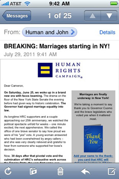
Here’s an email from the Human Rights Campaign viewed on an iPhone.

As you can see, while the email is displayed just as it would be for a desktop user, it doesn’t make for a great user experience on a small phone screen.
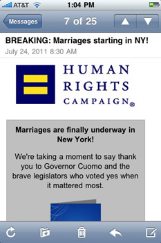
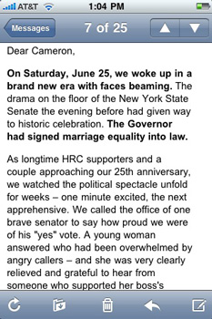
Now look at that same email after it was optimized for mobile phones:


Which version do you think your subscribers will be more likely to read and click?
When we tested a mobile-optimized version of an email against a non-optimized version of the same email, the optimized version resulted in more readers clicking on the email links.
OK. You’re sold. Emails perform better when they’re optimized for mobile users. So what do you do?
How to Make Your Email Mobile-Friendly
Code alert: If code makes your eyes cross, stop reading this right now and send this article to someone on your staff who’s techier than you. Otherwise, join me, and let’s dive in!
The key to making your HTML email look better on mobile devices is the CSS @media query, which allows you to define a different set of styles for your email based on screen size.
The @media query is supported by iOS (iPhone, iPod Touch and iPads), Android’s default mail client, and WebOS. Devices and email clients that don’t support the @media query, such as Android’s Gmail app (and Gmail in general) will display your email with your default styles.
Here’s the basic @media query structure:
@media only screen and (max-device-width: 480px) {
  [define your mobile-friendly styles here]
}
The above example will tell email clients to only apply the included styles on screens that are 480 pixels wide or less (480px being a common width for smartphones, such as the iPhone). For those familiar with the iPhone, while the iPhone 4 and iPhone 4S have a screen resolution of 640×960 instead of the 320×480 size found in the earlier models, they still behave as though their screen resolution is 320×480.
For example, let’s say you have a 600-pixel wide email with a wide logo at the top:
<html>
<body>

<table width="600">
  <tr>
    <td width="600">
      <a href="https://www.mywebsite.org/"><IMG SRC="logo.jpg" width="600" height="100" /></a>
      [Your email copy here.]
    </td>
  </tr>
</table>

</body>
</html>
To make this email mobile-friendly, we’ll want to make both the containing table and the logo much narrower so they fit nicely on a mobile screen. To do this, we’ll define a few mobile-only CSS classes in the @media query and apply those classes to the table and image.
<html>
<head>

<style>
@media only screen and (max-device-width: 480px) {
  table[class="table"], td[class="cell"] {
    width: 300px !important;
  }
  img[class="logo"] {
    width: 300px !important;
    height: 50px !important;
  }
}
</style>

</head>
<body>

<table width="600" class="table">
  <tr>
    <td width="600" class="cell">
      <a href="https://www.mywebsite.org/"><IMG SRC="logo.jpg" width="600" height="100" class="logo" /></a>
      [Your email copy here.]
    </td>
  </tr>
</table>

</body>
</html>
Two important things to note about this example:
- The “!important” declaration is included in the mobile-friendly CSS to ensure those styles overwrite any other styles that may also apply to those elements.
- Unfortunately Yahoo! Mail will ignore the @media rule and instead apply all of your mobile-specific CSS styles, regardless of the screen size. This means desktop users of Yahoo! Mail will see the mobile-version of your email. To avoid this, use the attribute selector format for defining CSS styles.
For example change this:
.logo {
  width: 300px !important;
  height: 50px !important;
}
…to this
img[class="logo"] {
  width: 300px !important;
  height: 50px !important;
}
For a more an in-depth example of optimizing email for mobile devices, including sample code, I highly recommend checking out Campaign Monitor’s review of how they optimized their eNewsletter.
Now this is just the beginning of what’s possible for mobile email. If you’re really gung-ho, you can change the layout of your email, crop or replace images, or even hide or display text for mobile readers.
Good luck and happy optimizing!


