It is a truth universally acknowledged: Images rule Facebook. When you’re scrolling through posts about what someone ate for breakfast or how long their commute took, an interesting photo is like an oasis in a desert of digital monotony. And ever since Facebook unveiled large-dimension images in the News Feed last year, brands, organizations, and George Takei have been capitalizing on the new layout with simple images that drive home a point with a funny photo or moving quote. We’ve been calling these “image shares” because well, they’re images… that people share.
There’s no sure way to make your image share go viral and take over the internet. But these simple tips will help you create content that your followers will be eager to share – the rest is up to them.
 Use graphics you can actually see. Don’t waste time with images that won’t actually be visible from the News Feed. Distinct images, bright graphics, or high contrast photos tend to get the most attention. Photos – especially mobile photos – shot in poor light make for bad shares since Facebook users tend to quickly scroll past an image where the faces or subject take too long to detect. Using recognizable people, such as Mitt Romney in this HRC image, will get your image more attention because people can spend less time trying to identify your image’s subject.
Make your text glow. If you’re going to use text on your image, make sure it’s clear and easy to read from the News Feed. We recommend using a sans serif font whose color contrasts sharply with its background – yellow text on black background, for example. In the News Feed, images get reduced in size, so if you want to get a feel for how your image will look as people scroll past it, do some experimenting in Photoshop or Apple Preview until you get the right feel.
 Keep your text simple. The HRC example at right earned over 10,000 shares in part because its subject – Washington Governor Chris Gregoire – is recognizable, but also because her quote is simple, straightforward and powerful. Too much text can become a burden and deter people from clicking to read more. But make sure you don’t cut out emotion when you cut down for length – your text should evoke feeling, whether it be outrage, inspiration, humor, or sarcasm.
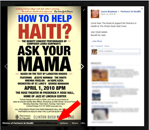
Don’t leave critical information at the bottom. In Facebook’s theater view, a slightly transparent black bar appears across the bottom of images, blocking out any text. That’s unfortunately the spot where a lot of groups place campaign site URLs or other important information. Since the placement of that bar isn’t based on pixels, the only way to really find out if your image is going to get covered is if you test it. You can upload the image on your personal profile and use the “Only Me” privacy setting so that nobody sees it ahead of time – or just delete it quickly. Check out the bottom bar in this event poster example from Partners in Health to see what I mean.
Be mindful of “the golden square.” Below is what a recent MoveOn image share looks like on the full Facebook site and what it looks like in the iPhone app. Unfortunately, the News Feed on mobile apps chopped the bottom off rectangular images – therefore cropping out the punchline. Considering that Facebook users spend more time on the mobile site than the full site, it’s really important that you make sure your image displays well on the mobile app. Keep the height and width of your image (or at least the part you want everyone to see) close to a 1:1 ratio. (By the way, this cropping also happens in Timeline, even on a desktop – even more reason to keep the good stuff in the golden square). As far as size goes, it’s best to keep your image height and width at or under around 500 pixels – anything bigger, and your image won’t resize as well on the screen.

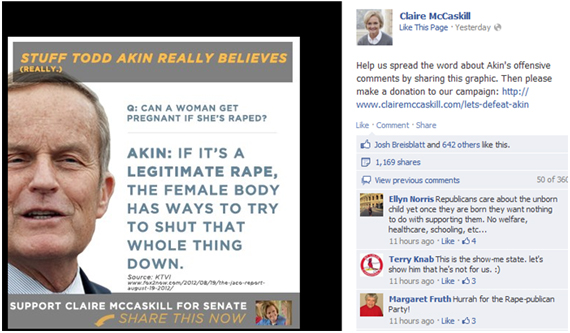
Write relevant captions. A great photo or quote can go a long way – but if you’re not clear about what you want followers to do with your image, odds are they won’t do it at all. Make sure the copy you post with your image asks people to share the image, like in the example below from the Claire McCaskill campaign. If you’re trying to drive traffic to your website, post a link with the image, too.
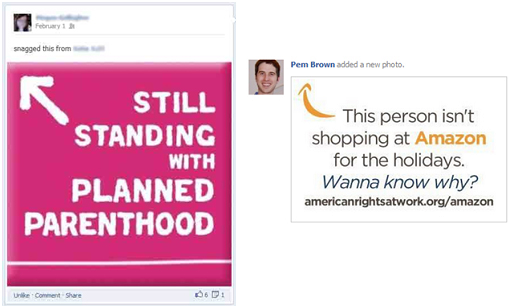
Get your arrows unstraight. When Facebook launched the revamped News Feed and larger images began playing a more prominent role, graphics relying on arrows that pointed up to a person’s profile picture became very popular. Those “this person” images with arrows still work nicely in the News Feed where the profile picture is offset to the left of the posted content. On Timelines, however, profile pictures fall directly above the shared content, so 45-degree diagonal arrows end up pointing in a slightly skewed direction, as is the case in this Planned Parenthood image at right. A better bet is to use an arrow that points upwards, but not directly at any profile picture, like we did in this image share for American Rights at Work. It just so happened that we borrowed Amazon’s own a-to-z arrow for this post highlighting the poor treatment of their employees.
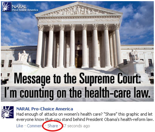
Make sharing simple. Ok, you did it. You created an awesome image optimized for Facebook and posted it to your page. Now what? If the message is really important to spread, you can send an email to (a portion of) your list and ask them to share it. In that case, you have two options: One is to use the one-step share function so all they do it personalize their message and click “share” to post to Facebook. However, if your image already has hundreds of shares on Facebook, you might want to consider sending your supporters directly to the photo and ask them to click “share” on it. If you decide to take that route, make the second step very clear by highlighting the share function in the picture you send over email, like NARAL did here:
Lots of organizations are using image shares for a good cause – what are your favorites? Share them on our Facebook page!

Hi Ezra and Alli,
Thanks for sharing these insightful tips. I especially like the tip: “Don’t leave critical information at the bottom”. I think it’s a habit many of us fall into. Thanks again!
What wonderful tips- thank you. Another organization that does a great job of creating shareable graphics and images is ThisIsPersonal.org, especially on their Facebook Page.
Your “one-step share function” doesn’t seem to work on mobile.
When I click it on an iPhone, it gets sent to:
https://m.facebook.com/sharer.php?u=http%3A%2F%2Fwww.facebook.com%2Fphoto.php%3Ffbid%3D382573471782026&set=a.382564401782933.85857.104748369564539&type=3&theater&_rdr
Which gives a “Your link could not be found” error.
Any idea how to fix that?