 In the world of online fundraising, there are plenty of truths that are considered beyond criticism: our sacred cows.
But rules are meant to be broken, or at least challenged, and sometimes you have to try something new even if it’s not “supposed” to work. That’s what we call sacred cow tipping — and the results can be surprisingly successful.
[Necessary sidenote for animal lovers and advocates: We in no way support literal cow tipping. But the metaphor fits! Because we did feel a little naughty when we tried these tactics that fly directly in the face of so-called “best practices.”]
A few examples of sacred cows we’ve tipped with our clients are below, but there are lots more! I’m going to talk about them at the DMANF Conference in New York this Thursday, July 18 at 12:45pm along with Karen Downs from CARE, Shannon Scanlan from Clinton Foundation, and Debbie Schneiderman from WCS.
Come on out to see our session on Thursday, and if you’re at the conference Wednesday, hit me up to score an invite to our fancy schmancy super secret party! For now, consider these 3 sacred cows tipped:
Sacred Cow #1: It needs to be new
At some point, you’ve probably been told that your online content always needs to be fresh and new. But with every email you send, only a percentage of recipients end up even seeing it, so why exactly can’t you send the same email more than once?
We decided to test this out with CARE, resending our most successful emails to anyone who didn’t open or click the first message. We changed the subject line and sent this second email 4 days later. The results? The second email raised even more money than the first — 60% more! Even if it doesn’t raise more money, a resend can bring in enough to make it worth the minimal effort required. CARE hasn’t heard any complaints from listmembers or seen a spike in unsubscribes, either.
Sacred Cow #2: If you want money, you gotta ask
This one’s obvious, right? You may even be wondering why (or how) we bothered to tip this particular cow. The answer – to this, and many of your online fundraising challenges – is Bill Clinton.
Every year, the Clinton Foundation asks supporters to send a birthday card to President Clinton. One year, we tested the standard model (make a donation in order send the card) against a free model (just add your name, then we land you on a donation page after signing).
The free version elicited a statistically significant larger number of supporters both clicking through and donating. Though the pay model had a much larger average gift and brought in slightly more revenue, we agreed that the tradeoff was well worth converting a substantially higher number of supporters into new donors. It’s a great way to have your cake and eat it, too – recruit the maximum number of emails through a low bar ask AND raise a ton of money from them right away.
Sacred Cow #3: A picture is worth a thousand words
Not to mix up our animal-based advice, but you could also call this sacred cow “put a puppy on it.” Wildlife and animal welfare groups would be crazy to not include photos of the cute or majestic animals they’re raising money for. That’s standard practice for us and WCS.
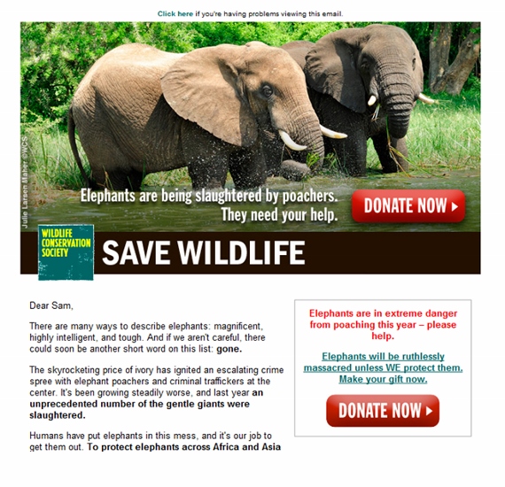
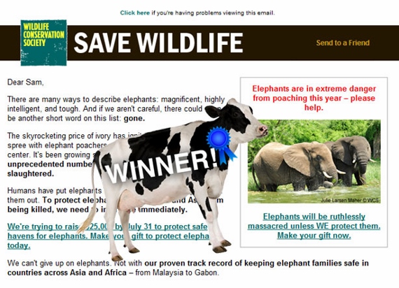
So if a photo is good, a bigger photo is better, right? Turns out the answer is no. When we pitted a standard layout with a callout box against a version with a big beautiful elephant image up top, the standard version won out in clicks and the difference was statistically significant. It also generated more gifts and revenue, but that difference wasn’t statistically significant. It’s hard to believe — look how beautiful this photo is!
Large photo version:

Standard callout box version:

So there you have it! Three cows formerly known as sacred, and 3 new tactics for you to try. So what about you – have you tipped any sacred cows recently? Let us know in the comments below or post on our Facebook.
And don’t forget: We have plenty more cow tipping stories to tell from Clinton Foundation, CARE, WCS, and many more clients at the DMANF Conference in New York this Thursday, July 18 at 12:45pm. See you there!

Interesting results, M+R! At Kiva, we also tested a large photo feature vs. a smaller photo in a call-out and actually had the opposite results (our larger photo out performed the smaller one). We’re not sure if it’s just the novelty factor since it was a new format or not – so we’ll likely test again.
Just goes to show that we need to keep testing because all organizations and lists are different.
Loved this article! Great ideas, very useful, and easy to test/put into practice. Great writing, great humor, great way to make work fun!
Good article and tips. At 54 Degrees we’ve had similar results. When sending the same email second time around we also edit the first paragraph as this can appear in preview panes in some email clients. This way the subject and message looks different. Never had any complaints.
We’ve had success with free ecards and then asking for donations but found the paid versions raised more money initially. I guess this needs to be weighed up carefully against the lifetime value of an email address which the free cards gained more of.
I also suspect the lower responses to the large header image may have something to do with the large amount of space without content that will appear to users who haven’t turned on images yet. This can be compensated by including alt text of course. Interesting to learn Kate’s experiences proved different which shows that constant testing can reveal different results on different lists