ARGsdkjfJASkl!!!! That’s how I feel whenever I hear that Facebook is rolling out a new change. It seems like every time we figure out how to use their features efficiently to market the awesome causes we support, they change them. It’s hard to keep up!
But since Facebook is still worth the headache, I tuned into their announcement yesterday so I could catch you up on what Facebook’s News Feed redesign means for nonprofit pages.
Here are three of the big changes that I see affecting your day-to-day strategy as the community manager of a Facebook page:
*Note: The “Old” images below are taken from our nonprofit clients while the “New” images are all from Facebook’s marketing materials because they haven’t actually rolled this change out yet! I’ll give an update once my News Feed switches over. I’m already on the waiting list.
1. Photo Posts
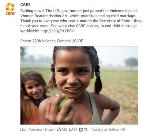
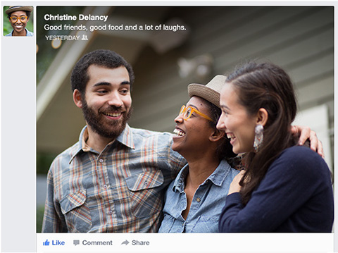
What’s changing: Photos will get a bit more real estate. ALSO, some captions will be layered over the image (at the top) instead of appearing above the image. Why only some captions? Facebook says, “We will only do so when we think the caption will be legible, when the image does not already contain text, and when the image is of sufficient size (at least 425x157px)”
Old News Feed:
 New News Feed:

How to adapt: It will be interesting to see how the captions issue shakes out. Will long captions, like CARE’s in the example above, get put over the photo? Will we need to keep captions shorter? It would be really nice to be able to have your call-to-action and link right ON TOP of the photo, instead of above it.
2. Link Previews
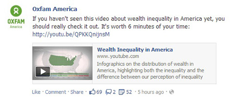
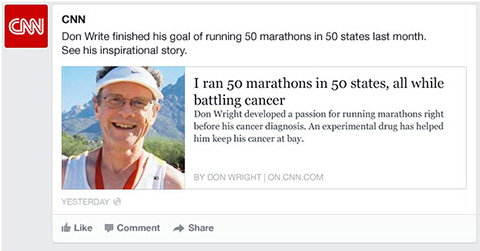
What’s changing: You may have already seen some changes in how link previews have been displaying recently, but most of them are like the Oxfam example below, with a really small preview box. In the new News Feed, when you share a link – or when any of your supporters share your link, there will be a large photo and more space for the Title and Description.
Old News Feed:
 New News Feed:

How to adapt: First, feel a little better about posting links on your page now that they’re more prominent – no need to attach a photo to your post just to get people’s attention. Second, think about what the preview content for your website is. Read (or re-read) my post about how to optimize your share content and check back to see when I update the number of characters in tip #5.
3. Page Like Stories
What changed: When someone likes your page, their friends will see a bigger snapshot of your page, complete with your cover photo. This also applies to any paid advertising you’re doing.
Old News Feed:
 New News Feed:

How to adapt: If you have an awesome Cover Photo already, you don’t need to change a thing! You may want to see if you find an uptick in new Page Likes originating from the News Feed, or even consider doing different types of ads.
There are a few more things that I want to mention – some cool, some not-so-cool, and some that I haven’t quite decided what to think of yet:
- Good to know. Facebook says the News Feed algorithm isn’t changing – so don’t ask! However, you just might find different content becoming more or less popular because of how people see it.
- Sweet! When a bunch of people share your awesome content (a.k.a., it “goes viral”), it will get more real estate than it used to.
- Bummer? People will be able to select a feed that looks at only their friends’ activity and none of the pages they follow, like yours. But who knows if this will catch on – in theory, people Like your page because they want to see your content, right?
- Meh. The ticker is gone, so you might lose a bit of your viral traffic, since people will see fewer of those stories that don’t carry enough weight to get into the News Feed. However, the fact that Facebook got rid of this means it probably didn’t generate a lot of traffic.
- Finally! The design will be more consistent from desktop to mobile, so hopefully you won’t have to think about two different user experiences for your supporters.
Want to stay up-to-date on the ever-changing world of social media and how you can harness it for your cause? Enter your email on the right to sign up to get our blog posts delivered right to your inbox.
And don’t forget to cruise our archive of Facebook tips and tricks.

Assuming Timeline still looks the same, any word on whether images in it that are wider or taller than 403 pixels will continue to be cropped in the Timeline when you don’t make it a Highlight? I so wish that Timeline would just shrink the graphic to scale rather than cropping it.
Hi Kristen – we haven’t heard anything about changes to photos on the Timeline. I agree that the cropping is annoying! If you start with something closer to a square, the cropping likely won’t be as bad, plus you’ll take advantage of the most space in the News Feed!
Also did you see my colleagues’ post on Facebook images for a cause? It’s a great read! https://labs.mrss.com/8-tips-on-facebook-images-for-a-cause/
Hi Kirsten – we haven’t heard anything about changes to photos on the Timeline. I agree that the cropping is annoying! If you start with something closer to a square, the cropping likely won’t be as bad, plus you’ll take advantage of the most space in the News Feed!
Also did you see my colleagues’ post on Facebook images for a cause? It’s a great read! https://labs.mrss.com/8-tips-on-facebook-images-for-a-cause/