Facebook just changed the way link previews are displayed. Specifically, they made them GINORMOUS.
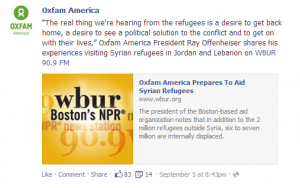
Here’s what they used to look like:
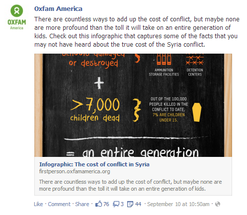
Here’s what they look like now:
Not only are the images big… the entire area below the text is ALL CLICKABLE. Both the image and the preview information take you right to the landing page.
This could mean more attention to your Facebook posts and more traffic to your page.
So how do you take advantage of this change?
Optimize the meta content on your pages.
We have said before that this is really important, and it still is. All your pages — especially those all-important donation and action pages you really want people to share — should have meta data. You just need to know the new specs.
Ensure your preview images are minimum 560 x 292 px to take advantage of this new large thumbnail format. If you want to make your images as big as they can be, Facebook recommends 1200 x 627 px as a maximum.
We’re not sure yet if the 20% text rule applies to preview images. (Facebook will probably make that clear soon enough.) We do know how to make the preview images to be powerful and shareworthy, so let’s do that!
Don’t be satisfied with the default image — upload your own!
If you’re a page admin, you can customize the preview photo for any link when you go to post, so make sure to pick a photo that is at least 560 x 292 px. If you don’t do this (and the page doesn’t already have a large image for the preview, which most won’t), your fans will see a smaller preview — with a much smaller image — just as they did in the past.
Even if you’re sharing a link to a different site, rather than to your own page, the bigger preview image will take up more space in your fans’ news feeds and look all the more enticing to click. Better experience for fans, better engagement for your page.
Reconsider your ad strategy.
Until now, we’ve been recommending that you promote images (with links in the caption), rather than just promoting links, when you want to drive traffic to a page.
But now, links can be just as eye-catching. And we already know from the 2013 eNonprofit Benchmarks study that link posts are better at driving clicks than photo posts. So when you’re paying for impressions, link posts will probably get you the most clicks for the lowest cost. Consider using them more in your Facebook ad strategy!


You have two conflicting minimal optimal image sizes recommended in the post: the first is 560 x 292 (in “optimize the meta…) and the second is 506 x 292 (dont be satisfied…). Which is the right one?
The article says both 560×292 and 506×292. Which is correct?
You are both too sharp for us! That’s a typo that got past us. It’s 560px by 292 px.
Hello there. Thanks for the great information. Any ideas on why Facebook sometimes gives me what you have above as the old format and sometimes gives me the new format with the large pic?
Standard image size for our news site articles are 300×400. Sometimes it will give me the big version of that pic, albeit pixelated (sp?), and sometimes it gives me the little box on the side.
Thanks for any help you can give and let me know how I can pay it back or forward. 🙂
Margaret Grigsby