Read time: 4 minutes
A couple of years ago I decided that I was spending too much time staring at screens, and resolved to cut back. Then the pandemic hit and, welp, that resolution went right out the window. These days our eyeballs are glued to screens for everything from birthday parties to webinars to fundraising galas.
Those of us who find it difficult to cut back on total screen time still need to give our peepers a break in any way we can. And even if that’s not you, it’s definitely a big chunk of your audience.
Enter Dark Mode (also known as dark theme or night mode)—a handy little bit of functionality that inverts the colors of an email, automatically and behind the scenes. You may have used it yourself to reduce eye strain, cut down on blue light before bed, or just to squeeze a little extra battery life out of your phone.
For regular user-to-user emails, like the message you send to your friends about going on a socially distanced hike, this works well and consistently across email clients. It swaps out text and background color easily, so your black text on a white background turns into white text on a black background.
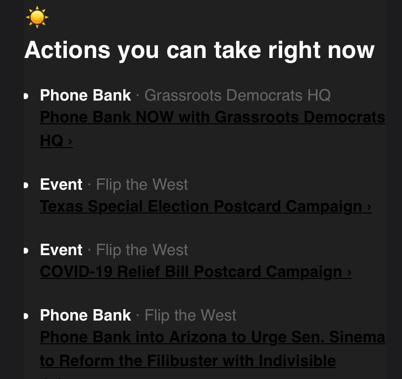
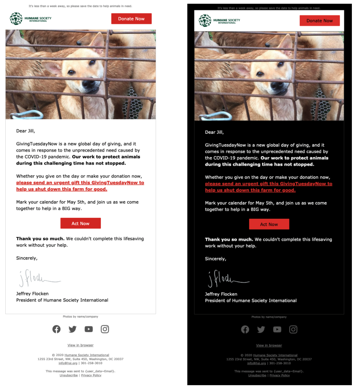
But for your custom HTML emails—the ones you build and send out to your subscribers—it’s not that simple. Email clients flip colors light-to-dark based on a formula that does not take into account your brand book or simple common sense. So your lovely design elements—say, a beautiful bright yellow button—turn into something ugly—like a mud-brown button. Depending on the colors and the contrast, it may even turn out impossible to read.

This is what it looks like when bad dark mode happens to good email.
What should we do about it?
Embrace Dark Mode! Your subscribers have—in 2020, 33% of all email opens occurred on Apple iPhone, and of those, 36% of Apple iPhones were using Dark Mode. (Gmail offers a similar dark theme to Android users, but doesn’t provide a means for tracking how many people use it. Still, based on the iPhone stats, it’s probably safe to guess it’s around 1 in 3.)
Here’s how:
- Set your phone to dark mode—if you haven’t yet—and pull up some recent emails to see how they’re coping with the light-to-dark swap.[spacer height=”20px”]
- Look at your button and link colors to see how they invert in a dark color scheme. If the contrast is hard to read (or they’re just ugly) work with your design or branding team to pick new colors that look good even when flipped.[spacer height=”20px”]
- Something to keep in mind (in regular and dark mode) is how accessible your email is. When it comes to colors, we recommend meeting WCAG AA contrast levels to make sure everything’s legible to everyone. You can use this tool to check if your colors meet the mark.
- For images with transparent backgrounds, pick a color that looks good on both dark and light backgrounds. For example, gray for someone’s signature or bright blue for social icons.
- For images that can’t work with both dark and light backgrounds—like if your organization’s logo has white or black in it—make sure it has a solid background.

For Gmail, that’s all you can do—-Google has not announced plans to support any tags to control dark mode. That means your content gets the default Gmail dark mode treatment as long as the user has set their device to allow it, and there’s nothing you can do to customize it for your branding. But for other email clients that support dark mode, you can take a little more control by adding new CSS code that allows you to use different styles for dark mode—like text, link, or background colors that respect the dark mode aesthetic but match more closely to your style guide (or aesthetic sense!).
<style>
@media (prefers-color-scheme: dark)
{
/* Your dark mode styles: */
}
</style>
There are also 2 meta tags to say your message supports dark mode, which communicates to email clients that support it (like Apple!) that you’ve got your dark mode styles ready to go. 😎
<meta name="color-scheme" content="light dark">
<meta name="supported-color-schemes" content="light dark">
How you handle dark mode options is similar to a lot of other optimization efforts: start by trying to experience your content from the user’s perspective. If that means fiddling with your own settings and spending even more time in front of various screens…well, these are the kinds of sacrifices we need to make.
Have you experimented with dark mode? Have any other fun tips to share? Find us on social @mrcampaigns and let us know how it’s going on the dark side!
————
When Anne’s not nerding out over deliverability or the newest email tool functionality, she’s doing her best to keep her knitting yarn out of her cats’ claws. You can find her at APaschkopic@mrss.com.

The dark mode is the best option in mobile for people who have eyesight issues. You can use dark mode at night so that it does not affect your eyes.